
As mobile devices continue to develop and become the primary means of accessing the internet, ensuring our website maintains consistency across various platforms is a crucial factor in development. However, some CSS properties behave inconsistently across different devices that lead to UI issue. In this article, I will discuss some CSS properties that should be avoided or used with caution, along with safer and more efficient alternatives.
1. 100vh (Viewport Height)
In the past, I often used 100vh to style elements that needed to fit the height of the viewport, like hero-section on landing pages or full-screen modals. However, this approach can be problematic, especially on mobile and tablet devices. Let’s take a closer look at why.
index.html
<!DOCTYPE html><html lang="en"><head> <meta charset="UTF-8" /> <meta name="viewport" content="width=device-width, initial-scale=1.0" /> <title>100vh Issue Demo</title> <link rel="stylesheet" href="style.css" /></head><body> <section class="hero" id="hero"> 100vh section </section> <script src="script.js"></script></body></html>
style.css
html, body { margin: 0; padding: 0;}.hero { height: 100vh; background: linear-gradient(to bottom, #4facfe, #00f2fe); display: flex; align-items: center; justify-content: center; font-size: 2rem; color: white; text-align: center;}a. Problems
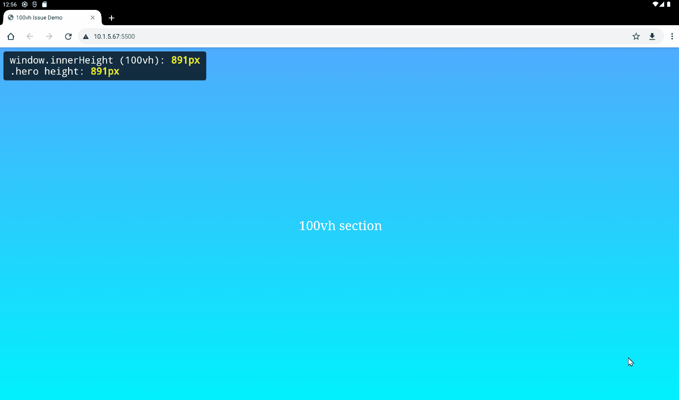
- On desktop browsers, 100vh represents the actual viewport height (excluding the address bar) and doesn’t change when scrolling.
As shown in the image below, the .hero section takes up the full height of the viewport, and no scrollbar appears.

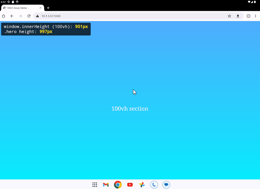
- On mobile/tablet Safari and Chrome, 100vh includes the address bar, which hides when scrolling.
As you can see in the image below (Android Chrome), when the address bar is visible, the .hero section (997px) is taller than the actual visible area (901px) . After scrolling down (which hides the address bar), the visible height adjusts and now matches window.innerHeight.
b. Fixes
b.1. Use dvh (dynamic viewport height) instead.
This unit adjusts the height dynamically as the visible viewport changes (e.g., when the address bar hides on scroll).
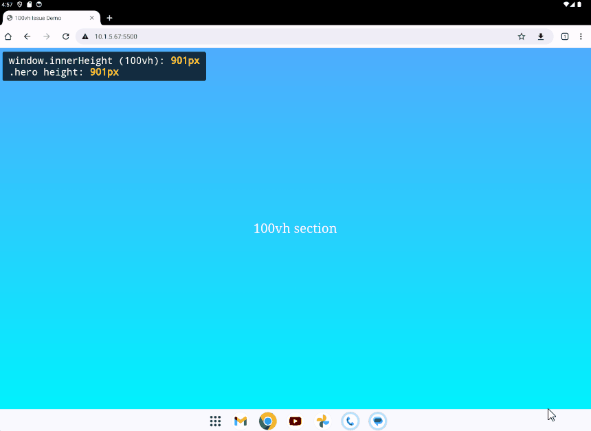
.hero { /* height: 100vh; */ height: 100dvh; /* ... */}After applying dvh, on Chrome Android, the .hero section height matches exactly the actual visible area height.
Pros:
- Reflects exactly the visible viewport area
- Works well across modern mobile and desktop browsers
- Pure CSS, no need for extra JavaScript
Cons:
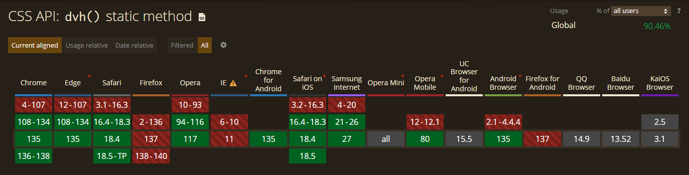
- Not supported in older browsers such as Safari below 16.3 or Chrome below version 135
b.2. Use JavaScript to calculate the real height.
style.css
.hero { /* height: 100vh; */ height: calc(var(--vh, 1vh) * 100); /* ... */}
script.js
function setVhVariable() { const vh = window.innerHeight * 0.01; document.documentElement.style.setProperty('--vh', `${vh}px`);}window.addEventListener('load', setVhVariable);window.addEventListener('resize', setVhVariable);
After applying the script, on Chrome Android, the .hero section height matches exactly the actual visible area height.
Pros:
- Work in modern and older browsers
Cons:
- Requires JavaScript execution and may cause a flicker before height is applied
- Harder to maintain, must sync between CSS and JS logic
- Handling events like "load", "resize" to maintain accurate height can impact performance, especially on mobile devices
b.3. Combine dvh and JavaScript fallback
We can get the best of both by using dvh in modern browsers and falling back to JavaScript when it isn’t supported.
style.css
.hero { height: calc(var(--vh, 1vh) * 100); /* fallback for older browsers */ height: 100dvh; /* modern override */ /* ... */}
script.js
function setVhVariable() { const vh = window.innerHeight * 0.01; document.documentElement.style.setProperty('--vh', `${vh}px`);}// Only apply JS fallback if `dvh` is not supportedif (!CSS.supports("height", "100dvh")) { window.addEventListener('load', setVhVariable); window.addEventListener('resize', setVhVariable);}
2. overflow: scroll
In some layouts, I used overflow: scroll to create scrollable containers and expected scrollbars to behave consistently across devices. Initially, everything appeared fine during development, but later I noticed that scrollbar behavior varied between devices. In some cases, scrollbars appeared even when there was no overflowing content, which affected the visual design and layout unexpectedly.
index.html
<!DOCTYPE html><html lang="en"><head> <meta charset="UTF-8" /> <meta name="viewport" content="width=device-width, initial-scale=1.0" /> <title>overflow: scroll Issue Demo</title> <link rel="stylesheet" href="style.css" /></head><body> <div class="scroll-box short-content"> <p>Short content.</p> </div> <div class="scroll-box overflow-content"> <h2>Overflow content.</h2> <p> <!-- Very long content --> </p> </div> <script src="script.js"></script></body></html>
style.css
.scroll-box { width: 300px; height: 200px; overflow: scroll; border: 4px solid #ccc; padding: 12px;}a. Problem
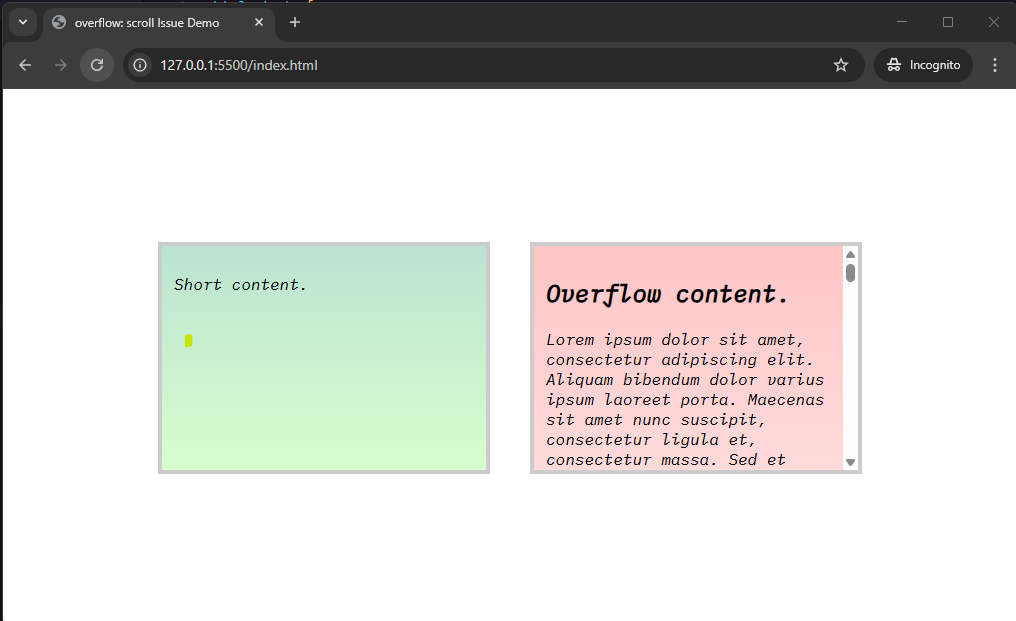
- On Chrome (Windows): scrollbars always appear, even when there’s no overflowing content.

- On Chrome / Safari (macOS/iOS): scrollbars only appear if the content actually overflows and the user interacts with or scrolls within the container. If the content doesn’t overflow, or if the area isn’t actively scrolled, no scrollbar is shown — even though overflow: scroll is applied.

b. Fix
Use overflow: auto for more natural behavior
.scroll-box { width: 300px; height: 200px; /* overflow: scroll; */ overflow: auto; border: 4px solid #ccc; padding: 12px;}
- On Chrome (Windows): the scrollbar only appears when content overflows
- On Chrome and Safari (macOS/iOS): behavior remains the same as before, scrollbars appear only when needed
Conclusion
Building responsive websites today means going beyond just media queries and flex layouts. As you've seen, certain CSS properties like 100vh or overflow: scroll may behave differently across browsers and platforms.
To make layout work better on different devices:
- Try to use new units like dvh if the browser supports it. If not, use JavaScript to set the height correctly.
- Use overflow: auto instead of overflow: scroll so scrollbars only appear when needed.
- Always test your layout on different types of devices, not only desktop or emulators.
By knowing these small differences and choosing safer ways to write CSS, we can avoid problems and make the website look better for everyone.
References
- Numeric data types. https://developer.mozilla.org/en-US/docs/Web/CSS/CSS_Values_and_Units/Numeric_data_types
- CSS API: dvh() static method. https://caniuse.com/mdn-api_css_dvh_static
- Header image from: https://www.pexels.com/photo/gray-laptop-computer-showing-html-codes-in-shallow-focus-photography-160107/