
Managing styles in a growing desktop application can be difficult. The most effective solution to this problem is using WPF Resource Dictionaries. By decoupling your UI logic from your code, you can create applications that are modular, easier to extend, and ready for advanced features like theming. [Learn more about WPF Overview here]
WPF offers one of the most powerful styling systems among desktop UI frameworks. However, a "God-file" App.xaml with 2,000 lines of code is a maintenance nightmare. In this guide, we will build a professional styling architecture from scratch using WPF Resource Dictionaries.
Why Use WPF Resource Dictionaries?
Organizing styles into dedicated files isn't just about aesthetics; it is about engineering a solid foundation. Implementing WPF Resource Dictionaries properly offers several key advantages:
-
Maintainability: Your
App.xamlremains a clean entry point instead of a dumping ground. -
Modularity: Styles are grouped by context (e.g.,
ButtonStyles.xaml,FormStyles.xaml). -
Reusability: You can copy your Styles folder to a new project and immediately have your custom branding.
-
Scalability: This structure supports complex features like "Dark Mode" much better than a single monolithic file.
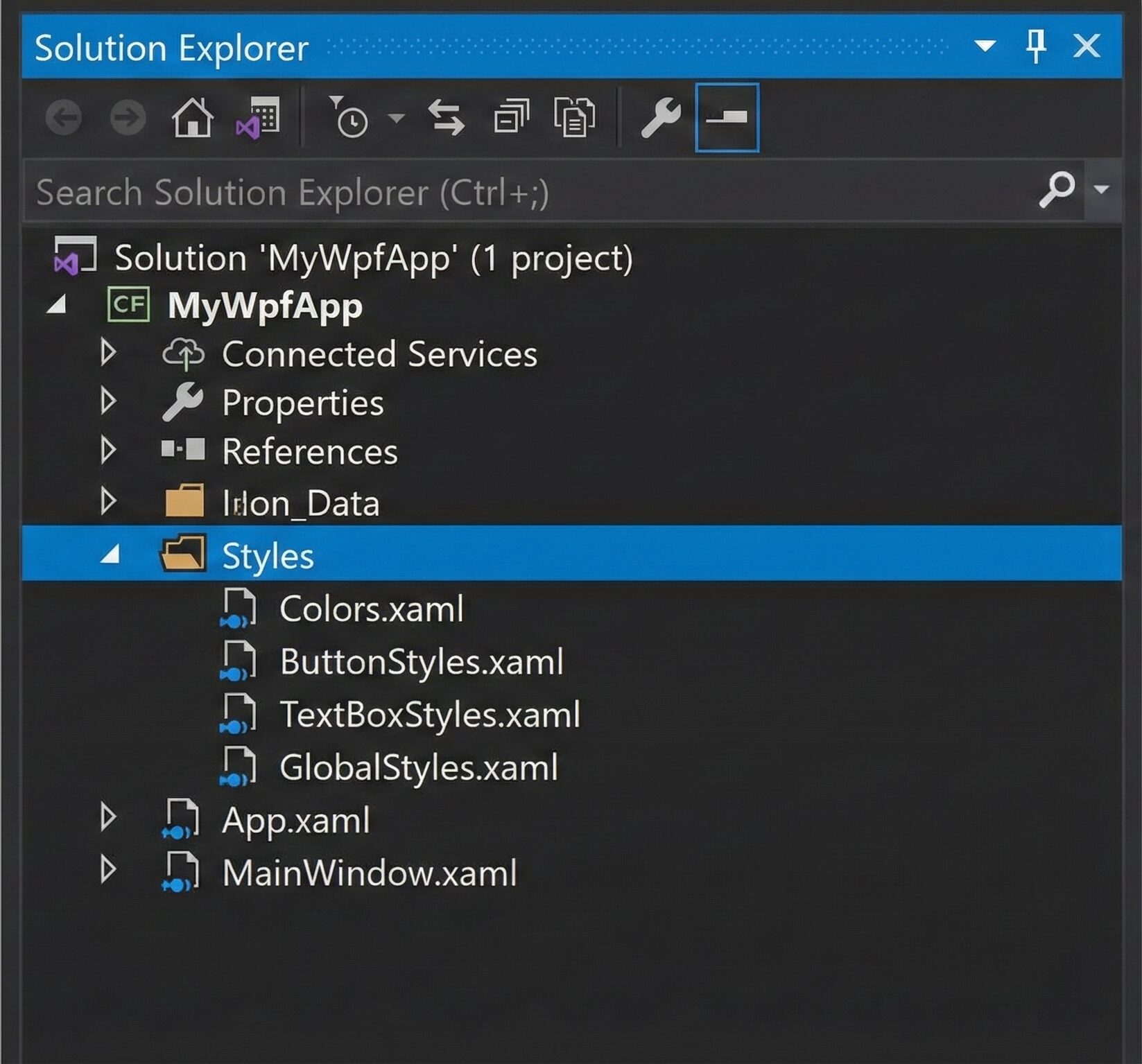
Structure Your Project
First, let’s establish a clean directory structure. Inside your project, create a new folder named Styles.
Your Solution Explorer should look like this:
Define Your Color Palette
Before styling buttons, we should define our colors. Defining them centrally in **WPF Resource Dictionaries** prevents "magic hex codes" (like #2D89EF) from being scattered all over your code.
Create Styles/Colors.xaml:
```xml
<ResourceDictionary xmlns="http://schemas.microsoft.com/winfx/2006/xaml/presentation"
                    xmlns:x="http://schemas.microsoft.com/winfx/2006/xaml">

    <Color x:Key="PrimaryColor">#2D89EF</Color>
    <Color x:Key="PrimaryHoverColor">#2b73c4</Color>
    <Color x:Key="DisabledColor">#CCCCCC</Color>

    <SolidColorBrush x:Key="PrimaryBrush" Color="{StaticResource PrimaryColor}"/>
    <SolidColorBrush x:Key="PrimaryHoverBrush" Color="{StaticResource PrimaryHoverColor}"/>
    <SolidColorBrush x:Key="DisabledBrush" Color="{StaticResource DisabledColor}"/>
    <SolidColorBrush x:Key="TextBrush" Color="#333333"/>
</ResourceDictionary>
Create a Custom Button Style
Now, let's create a button that uses the colors we defined above. We will add a ControlTemplate to change the shape. Additionally, Triggers will be used to handle Hover and Pressed states smoothly.
Create Styles/ButtonStyles.xaml:
<ResourceDictionary xmlns="http://schemas.microsoft.com/winfx/2006/xaml/presentation"
                    xmlns:x="http://schemas.microsoft.com/winfx/2006/xaml">

    <Style TargetType="Button" x:Key="PrimaryButton">
        <Setter Property="Background" Value="{StaticResource PrimaryBrush}"/>
        <Setter Property="Foreground" Value="White"/>
        <Setter Property="Padding" Value="15 8"/>
        <Setter Property="FontSize" Value="14"/>
        <Setter Property="BorderThickness" Value="0"/>
        <Setter Property="Cursor" Value="Hand"/>

        <Setter Property="Template">
            <Setter.Value>
                <ControlTemplate TargetType="Button">
                    <Border x:Name="border"
                            Background="{TemplateBinding Background}"
                            CornerRadius="4"
                            SnapsToDevicePixels="True">
                        <ContentPresenter VerticalAlignment="Center"
                                          HorizontalAlignment="Center"
                                          Margin="{TemplateBinding Padding}"/>
                    </Border>

                    <ControlTemplate.Triggers>
                        <Trigger Property="IsMouseOver" Value="True">
                            <Setter TargetName="border" Property="Background" Value="{StaticResource PrimaryHoverBrush}"/>
                        </Trigger>
                        <Trigger Property="IsPressed" Value="True">
                             <Setter TargetName="border" Property="Opacity" Value="0.8"/>
                        </Trigger>
                        <Trigger Property="IsEnabled" Value="False">
                            <Setter TargetName="border" Property="Background" Value="{StaticResource DisabledBrush}"/>
                            <Setter Property="Foreground" Value="#666666"/>
                            <Setter Property="Cursor" Value="Arrow"/>
                        </Trigger>
                    </ControlTemplate.Triggers>
                </ControlTemplate>
            </Setter.Value>
        </Setter>
    </Style>
</ResourceDictionary>
Key Detail: Notice the use of ControlTemplate.Triggers. This allows us to target specific elements inside the template (like the Border named "border") for visual updates.
Create a TextBox Style
TextBoxes often require specific structural elements to function correctly. Therefore, the template is slightly more complex.
Create Styles/TextBoxStyles.xaml:
<ResourceDictionary xmlns="http://schemas.microsoft.com/winfx/2006/xaml/presentation"
                    xmlns:x="http://schemas.microsoft.com/winfx/2006/xaml">

    <Style TargetType="TextBox" x:Key="RoundedTextBox">
        <Setter Property="Padding" Value="5"/>
        <Setter Property="FontSize" Value="14"/>
        <Setter Property="Foreground" Value="{StaticResource TextBrush}"/>
        <Setter Property="BorderBrush" Value="#AAAAAA"/>
        <Setter Property="BorderThickness" Value="1"/>
        <Setter Property="Background" Value="White"/>
        <Setter Property="VerticalContentAlignment" Value="Center"/>

        <Setter Property="Template">
            <Setter.Value>
                <ControlTemplate TargetType="TextBox">
                    <Border x:Name="border"
                            CornerRadius="4"
                            BorderBrush="{TemplateBinding BorderBrush}"
                            BorderThickness="{TemplateBinding BorderThickness}"
                            Background="{TemplateBinding Background}">
                        <ScrollViewer x:Name="PART_ContentHost" Margin="0"/>
                    </Border>

                    <ControlTemplate.Triggers>
                        <Trigger Property="IsKeyboardFocused" Value="True">
                            <Setter TargetName="border" Property="BorderBrush" Value="{StaticResource PrimaryBrush}"/>
                            <Setter TargetName="border" Property="BorderThickness" Value="2"/>
                        </Trigger>
                    </ControlTemplate.Triggers>
                </ControlTemplate>
            </Setter.Value>
        </Setter>
    </Style>
</ResourceDictionary>
Why PART_ContentHost? In the template above, the ScrollViewer named PART_ContentHost is essential. It tells WPF where the actual text goes. If you omit this, your TextBox will not display text. [Internal Link: Learn more about XAML Naming Conventions]
Merging WPF Resource Dictionaries
This is the most critical step. Styles defined in separate files are invisible until they are merged into the application scope.
Open App.xaml:
<Application x:Class="MyWpfApp.App"
             xmlns="http://schemas.microsoft.com/winfx/2006/xaml/presentation"
             xmlns:x="http://schemas.microsoft.com/winfx/2006/xaml"
             StartupUri="MainWindow.xaml">
    <Application.Resources>
        <ResourceDictionary>
            <ResourceDictionary.MergedDictionaries>
                <ResourceDictionary Source="Styles/Colors.xaml"/>
                <ResourceDictionary Source="Styles/ButtonStyles.xaml"/>
                <ResourceDictionary Source="Styles/TextBoxStyles.xaml"/>
            </ResourceDictionary.MergedDictionaries>
        </ResourceDictionary>
    </Application.Resources>
</Application>
Note on Order: The order matters! Since ButtonStyles.xaml uses resources defined in Colors.xaml, Colors.xaml must be listed above it.
Using the Styles
Now that everything is wired up, using the styles in your Views (MainWindow.xaml or UserControls) is simple.
Explicit Usage
Use the x:Key you defined.
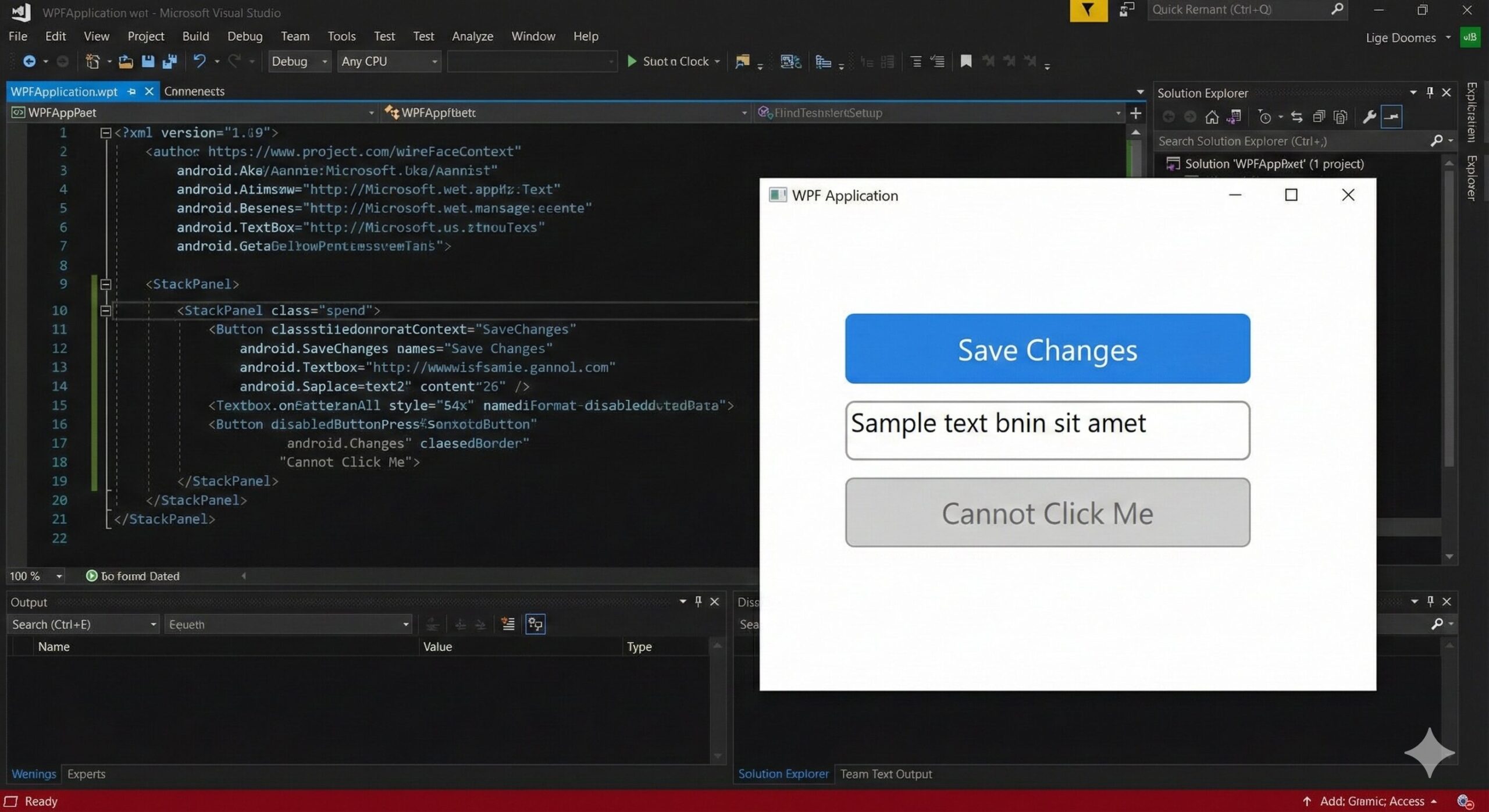
<StackPanel Margin="20" Spacing="10">
    <Button Content="Save Changes"
            Style="{StaticResource PrimaryButton}"
            Width="150"/>
    <TextBox Style="{StaticResource RoundedTextBox}"
             Width="250"/>
    <Button Content="Cannot Click Me"
            Style="{StaticResource PrimaryButton}"
            IsEnabled="False"/>
</StackPanel>
Implicit Usage (Global Defaults)
If you want every button in your app to look like this without typing Style="{...}" every time, you can create an implicit style. Add this to Styles/GlobalStyles.xaml:
<Style TargetType="Button" BasedOn="{StaticResource PrimaryButton}"/>Summary & Best Practices
Refactoring your UI with WPF Resource Dictionaries is a hallmark of professional development. Here is a checklist for success:
-
Logical Separation: Keep specific control styles in their own files.
-
Centralize Colors: Always use a
Colors.xamlorBrushes.xaml. -
Use BasedOn: When creating variations, use
BasedOnso you avoid rewriting the template. -
Static vs Dynamic: Use
StaticResourcefor performance. Only useDynamicResourceif you plan to change the resource while the app is running.
By following this pattern, you build a WPF application that is not only beautiful but also clean, organized, and easy to maintain. Happy coding!
References
Ready to get started?
Contact IVC for a free consultation and discover how we can help your business grow online.
Contact IVC for a Free Consultation