
First of all, let's find out what responsive design is. Responsive Web Design (RWD) is an approach to web design that enables websites to automatically adjust and optimize the user experience across a variety of devices, including desktops, tablets, and mobile phones. In today’s digital age, having a responsive website is crucial.
Introduction to Bootstrap
Bootstrap is one of the most popular CSS frameworks, providing developers with powerful tools to create flexible and user-friendly web interfaces. As of now, the latest version is Bootstrap 5.3, released in August 2023, which brings numerous improvements in features and performance.
Responsive Features of Bootstrap
- Grid System
-
- Bootstrap uses a 12-column grid system that allows for easy space sharing on the page. You can change the number of columns an element occupies on different screen sizes, ensuring that content is always well-organized.
- Responsive Classes
-
- Bootstrap provides a variety of responsive classes, such as .d-none, .d-sm-block, and .d-md-none, which allow you to hide or show content based on the device, offering flexibility in design.
- Responsive Images
-
- With the class .img-fluid, Bootstrap ensures that images automatically adjust their size according to the width of the container, preventing distortion and maintaining visual appeal.
- Flexible Components
-
- Bootstrap offers many components like navbars, cards, and modals that are designed to be responsive from the start. You can easily customize them to meet the needs of your project without having to write extensive CSS.
For example, you can create a layout where, on large screens (desktops), content is spread across multiple columns. On smaller screens (like tablets or mobile phones), the same content might stack into a single column for easier readability.
Let’s study the example below:
Example of a Bootstrap grid system:
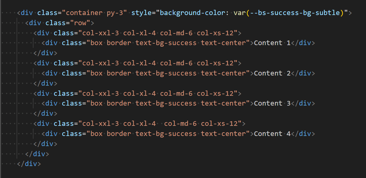
In this example:
On Extra extra large screens (col-xxl-3) ≥1400px , the content will be displayed in four equal columns on a row.
On Extra large screens (col-xl-4) ≥1200px , the content will be displayed in three columns on a row.

On Medium screens (col-md-6) ≥768px , the content will be displayed in two columns on a row.

On Extra small screens (col-xs-12) <576px , the content will stack into a single column.
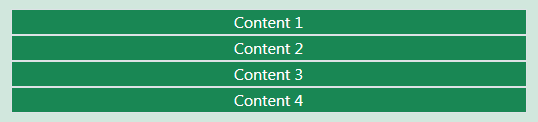
This responsiveness ensures the content is properly displayed across devices without breaking the layout.
Conclusion
With its powerful responsive features, Bootstrap enables developers to create visually appealing and user-friendly websites across all devices. If you are looking for an efficient solution for web development, Bootstrap is definitely a choice not to be missed.
Cover image from: Html and css collage concept